


Growth
For growing venues and catering companies.
€69 / month
- ✓ Unlimited events
- ✓ Embeddable inquiry form
- ✓ Priority support
A single reference for everyone shipping anything FoyerFlow-branded — marketing, product, sales, decks, social. If something on the page doesn't appear here, it doesn't exist yet.
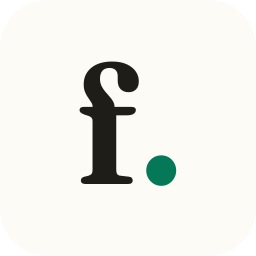
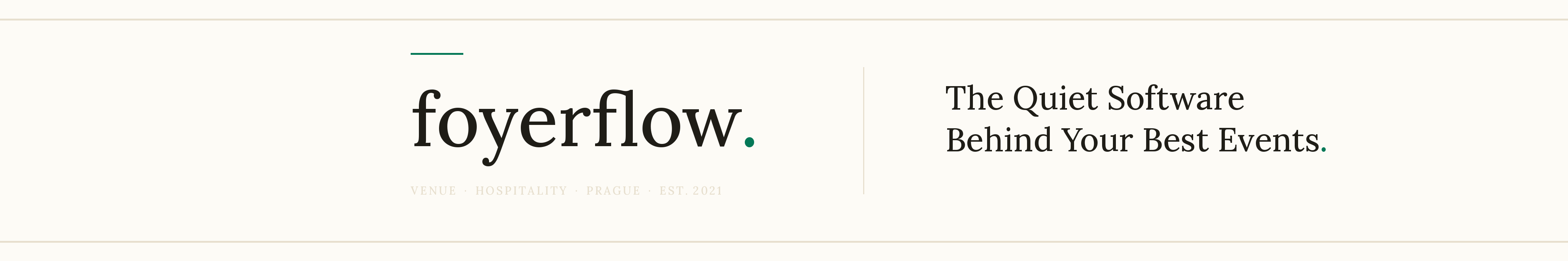
Pure typographic logo: FoyerFlow set in Fraunces, lowercase, weight 460, with a trailing period in emerald as a quiet brand sign-off. There is no icon. The typeface is the brand — editorial-hospitality convention (Aesop, Le Bernardin, Mews, Eleven Madison Park).
On cream / white
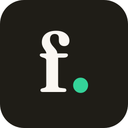
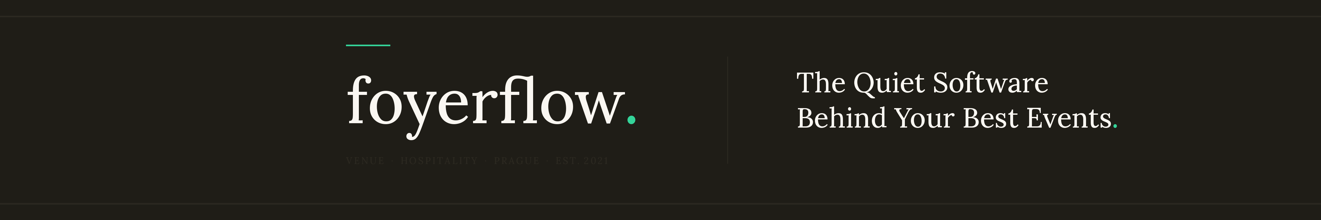
foyerflow.On charcoal / photo
foyerflow.
Wordmark switches to cream-50; the
period uses the brighter emerald-400
for legibility on dark surfaces.
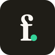
Mark only · Favicon
On light
On dark
Two ship-ready variants. The browser picks based on the system theme via
prefers-color-scheme — see Appendix A.
emerald-700 on light surfaces and
emerald-400 on dark. No outline, no shadow,
no enclosure. Don't substitute the period with a middle-dot, em-dash, or asterisk —
it's the period or nothing.
Drop these into partner decks, integration pages, "Powered by FoyerFlow" badges, and anywhere else you need the mark. Every asset ships in two formats: SVG for the web (crisp at any size, requires Fraunces to render correctly), and PNG for press kits, slide decks, Word / PowerPoint / Keynote, social uploads, and email signatures (Fraunces glyphs baked in — opens identically everywhere). When in doubt, reach for the PNG.
"foyerflow." in 6 variants — light, dark, mono × 2, on-cream, on-char. SVG + PNG (2048 px wide).
The "f." mark in the same 6 variants. For tight contexts and avatars. SVG + PNG (2048 sq).
Adaptive favicon + light / dark / Apple-touch sizes. SVG + PNG. Drop into /public.
Everything: 19 SVGs + 19 PNGs + BRAND-README.txt with usage rules and color values.
Hover any preview to read the filename. Click to download just that variant.
Wordmark
Mark
Favicon
Use SVG when…
You're embedding the mark on a webpage, in an Angular / React component, in an SVG-aware design tool (Figma, Sketch), or as a favicon. SVG scales without quality loss and the file is tiny — but the renderer must have access to Fraunces, otherwise it falls back to a generic serif.Use PNG when…
You're putting the mark in a slide deck (Keynote, PowerPoint, Google Slides), a Word document, an email signature, a press kit, a social-media post, or any context where SVG isn't reliably supported. Fraunces is baked in — the file renders identically on every device, no font install needed.PNG dimensions: wordmark 2048 × 547 px, mark 2048 × 2048 px, favicons at native (32 → 256 px) and PWA (512 px) sizes. Need a different size? Open the SVG in a browser and use "Save image as…", or render from the SVG with any image tool — install Fraunces first.
Social media · LinkedIn
Logo at 800 × 800 px (retina-sharp; LinkedIn auto-crops to a circle in feed
and follower lists — these have an 85% safe zone so the mark survives the crop).
Cover at 4200 × 700 px (LinkedIn's current high-resolution spec, 6:1) with
the avatar overlay area kept clean on the bottom-left.
The SVG sources re-render brand-faithfully on a machine with Fraunces installed —
run scripts/generate-social-art.py.
Logo · 800 × 800
Dark · primary
Recommended. Char-700 surface, cream "f.", emerald-400 dot. Reads strongest in LinkedIn feed.
Download PNG →
Light
Cream-50 surface. Use only if your page art is dark and the avatar needs to bright-pop.
Download PNG →
Cover · 4200 × 700
Light
Cream surface. Sits warmly against LinkedIn’s grey chrome.
Download PNG · SVG →
Dark · primary
Recommended. Char-700 surface — pairs with the dark avatar for dramatic contrast.
Download PNG · SVG →
Cream surfaces, charcoal type, emerald accent. Burgundy and brass appear only as small marks of distinction — never as button fills, never larger than 4 px.
Page top, lightest surface
Page background (default)
Alt surface, light bands
Hairlines, dividers
Subtle decorative
Tertiary text / metadata
Body muted, captions
Body, paragraph color
Headlines, primary text, dark surfaces
Deep dark backgrounds
Photo overlay base
Tag / badge background
Soft accent surface
Primary accent, success
Hover / pressed states
Soft accent surface
Private-event accent
Decorative gold detail
Premium accent
char-600 or darker (passes WCAG AA at 4.5:1).
Tertiary text uses char-400 at 14 px+ only.
On dark photo overlays, text below 16 px must use cream-50 at full opacity.
Fraunces (variable serif) for every heading. Inter for body, UI and small labels. Both load from Google Fonts. Heading optical-size axis set to 144 for warmth at large sizes.
Display 1
Hero only · 40 / 56 / 72 px · weight 480
The Quiet Software Behind Your Best Events.
Display 2
Section H2 · 32 / 44 / 52 px · weight 460
Built for Both Sides of Your Calendar.
Heading
Sub-section H3 · 24 / 30 px · weight 500
Conferences, Galas and Off-Sites.
Title
Card H4 · 20 px · weight 500
Drag-and-Drop Offer Builder
Lead
Section subtitle · 18 / 20 px · Inter 400
From the first inquiry to the final toast — FoyerFlow gives venue teams a single, calm place to plan events, build offers, manage staff and welcome guests.
Body
Default body · 15.5 px · Inter 400
Versioned proposals with services, locations and items. Drag to reorder sections; per-guest scaling and quantity adjustments recalculate in real time.
Small
Caption / metadata · 13.5 px · Inter 400
Each user picks their language; clients receive the PDF in the language you configure.
Eyebrow
Section eyebrow · 11 px · Inter 600 · 0.18em tracking · UPPERCASE
Built for Real Teams
Reserved for future contact forms and the embedded inquiry form. Borders are
1 px cream-300; focus ring is emerald, 2 px,
2 px offset against cream-100.
Three card types. All sit on cream — never directly on white in marketing contexts (this rule is relaxed inside the app for density).
Surface card
.card-surface — white background,
cream-300 border, no shadow.
Feature card
Used for the Features grid. Icon + index + serif title + body.
Pricing card · featured
For growing venues and catering companies.
Every editorial section opens with the same three-part rhythm. Don't deviate — even when tempted by a clever crosshead.
Lead paragraph at 18 px Inter regular, slate body color, max 60ch wide so the line length stays editorial.
Spacing rules — mt-5 between eyebrow and h2,
mt-5 between h2 and lead, mt-12 to mt-16 before
the section's content grid.
Two variants — one personal, one for shared role mailboxes. Both are table-based, inline-styled HTML so they render reliably across Gmail, Apple Mail, Outlook (desktop + web), and iOS Mail. No background colour, so the signature inherits whatever surface the email body is on.
Personal
For people in the company writing under their own name.
| Anton Eremeeff |
| Founder, FoyerFlow. |
| [email protected] · +420 607 700 700 |
| foyerflow.app |
Departmental · Shared inbox
For shared role mailboxes — support, sales, billing. No personal name; the brand signs.
| FoyerFlow Support |
| foyerflow. |
| [email protected] |
| foyerflow.app |
char-400. The trailing
emerald period after "FoyerFlow" stays — it's the same period accent
used in the wordmark. Rule: 32 px wide, 1 px tall,
emerald-700. Contact line
in Inter 13 px, char-500;
secondary line in char-400.
No avatar — this is a typographic brand, not a corporate headshot brand.
No banner image, no social-icon row — both add weight without value and
get stripped by half the email clients anyway.
<table cellpadding="0" cellspacing="0" border="0" role="presentation"
style="font-family: 'Inter', -apple-system, BlinkMacSystemFont, 'Segoe UI', Roboto, sans-serif; color: #1F1D17; line-height: 1.45;">
<tr><td style="padding: 0 0 6px;">
<span style="font-family: 'Fraunces', ui-serif, Georgia, 'Times New Roman', serif; font-size: 18px; font-weight: 460; letter-spacing: -0.012em; color: #1F1D17;">Anton Eremeeff</span>
</td></tr>
<tr><td style="padding: 0 0 12px; font-size: 13.5px; color: #6E6757;">
Founder, FoyerFlow<span style="color: #047857;">.</span>
</td></tr>
<tr><td style="padding: 0 0 10px;">
<span style="display: inline-block; width: 32px; height: 1px; background: #047857; line-height: 1px;"> </span>
</td></tr>
<tr><td style="font-size: 13px; color: #3F3A30;">
<a href="mailto:[email protected]" style="color: #1F1D17; text-decoration: none;">[email protected]</a>
·
<a href="tel:+420607700700" style="color: #1F1D17; text-decoration: none;">+420 607 700 700</a>
</td></tr>
<tr><td style="padding-top: 2px; font-size: 13px; color: #6E6757;">
<a href="https://foyerflow.app" style="color: #6E6757; text-decoration: none;">foyerflow.app</a>
</td></tr>
</table><table cellpadding="0" cellspacing="0" border="0" role="presentation"
style="font-family: 'Inter', -apple-system, BlinkMacSystemFont, 'Segoe UI', Roboto, sans-serif; color: #1F1D17; line-height: 1.45;">
<tr><td style="padding: 0 0 6px;">
<span style="font-family: 'Fraunces', ui-serif, Georgia, 'Times New Roman', serif; font-size: 18px; font-weight: 460; letter-spacing: -0.012em; color: #1F1D17;">FoyerFlow Support</span>
</td></tr>
<tr><td style="padding: 0 0 12px; font-size: 13.5px; color: #6E6757;">
foyerflow<span style="color: #047857;">.</span>
</td></tr>
<tr><td style="padding: 0 0 10px;">
<span style="display: inline-block; width: 32px; height: 1px; background: #047857; line-height: 1px;"> </span>
</td></tr>
<tr><td style="font-size: 13px; color: #3F3A30;">
<a href="mailto:[email protected]" style="color: #1F1D17; text-decoration: none;">[email protected]</a>
</td></tr>
<tr><td style="padding-top: 2px; font-size: 13px; color: #6E6757;">
<a href="https://foyerflow.app" style="color: #6E6757; text-decoration: none;">foyerflow.app</a>
</td></tr>
</table>Gmail
Open the rendered preview above in your browser, select the signature, copy, then paste into Settings → See all settings → General → Signature → Create new. Gmail keeps the inline styles.Apple Mail / iOS Mail
Same deal — copy the rendered preview, paste into Mail → Settings → Signatures. iOS uses the macOS signature when you sign into the same iCloud account.Outlook (desktop)
Outlook strips some inline styles. Best results: paste the rendered preview into a new email, then go File → Options → Mail → Signatures and copy from the email body into the signature editor.Don't
Don't add a banner image, social-icon strip, or "Sent from my iPhone"-style fluff under the signature. Don't render the whole signature as a PNG — kills accessibility, blocked by image-loading defaults, breaks reply-to-link behaviour.Photography is the most expressive part of the brand. Get this wrong and the whole page reads as stock-y.
Hero image
2400 px wide · 16:9 to 21:9 · ≤ 240 KB after WebP/AVIF
Feature / audience image
1600 px wide · 4:3 · ≤ 180 KB after WebP/AVIF
Calm, confident, slightly understated. We speak to professionals who already know their craft — never explain hospitality back to a hotelier.